Portfolio
Calendar
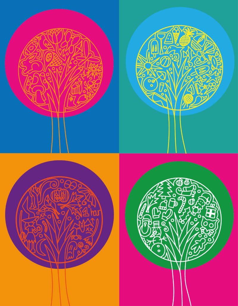
I came to the conclusion with calendar, I wanted to create a range of similar images using appropriate colour in which would match and express each season. This would represent the seasons originality and express through each illustration what each season brings to our year.
Using more vivid colours for spring seemed appropriate, the season represents the growth of nature. Drawing a range of images that relate towards spring, for example, flowers, Easter eggs and bunny’s.
Using bright colours for summer seemed appropriate, the season represents the temperature rising, a happy season for us all and a time we look forward too. drawing a range of images that would represent this season, for example the sun, sunglasses, shells and ice cream. These were among a range of different illustrations I assumed would express this specific season best.
Using more dark, Halloween colours, like purple and orange. I believe these colours express the season autumn. The season visually represents a beautiful range of colours, as the trees turn orange before the leaves fall. I used this colour as the central point, as I feel the colour orange is very important when expressing this season appropriately.
Using colours like green and white seemed appropriate for winter. Christmas is what everyone looks forward too, an aspect we remember the most from this specific season, so using these colours seemed appropriate to express the illustration. Using a range of illustrations for example, Santa, gloves, hats and snow men, I felt as though this would represent the image correctly.
The overall image as a tree I believe is something that throughout each season will change the most, changing in size, colour and in winter presented with decoration’s. The tree seemed the most appropriate way to express each season and the differences and similarities they share.
Remedy Pale Ale
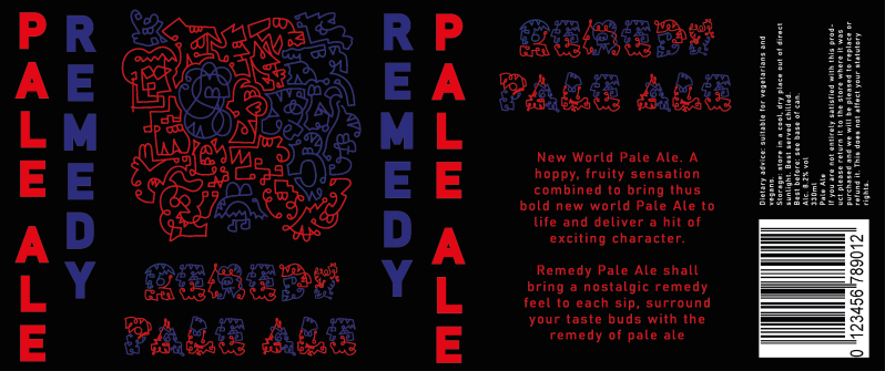
I had the idea to create a remedy pale ale. Using this word as an example, I feel as though consuming a cold beverage is a remedy we all look forward too. Everyone is excited for the weekend to arrive. A remedy allows us to relax and feel free, until Monday arrives again. A remedy that changes the way we feel and see things. I felt as though creating a pale ale was an appropriate idea when using this word.
I wanted the can to possess a range of colour and detail, I began with smaller sketches. Going straight into each drawing without any inspiration, the aim was to keep my pen to the page and attempt to create a range of crazy characters. The characters are difficult to understand from first glance, but after taking a closer look I would assume most buyers could understand the illustrations.
Each character expresses a different personality and facial expression, I felt as though this was appropriate, although drinking is a remedy, for some drinking can bring different expressions and feelings towards life. I feel as though my characters represent a range of different feelings from happy to sad. I’ve also attempted to create a range or characters within my text. Using the same two colours I have attempted to create a range of simplistic line drawings, with a range of different expressions through each letter.
I used two primary colours to represent my illustrations. I feel as though these two colours work really well together, catching the eye of potential buyers, presenting the colours with a black background has allowed the colours to stand out.
Public Convenience
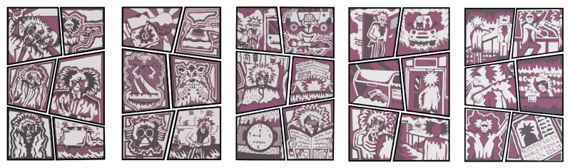
I had the idea of creating a comic book for this specific word. The story is about two scientists who have created a robot that will be released to the world, the robots aim is to help people with inconvenient tasks throughout day to day life. But one scientist has a different idea on his mind. He wants to use these crazy robots to take over the world. The book guides the reader through a range of illustrations and drama that occur along the way.
I have created a range of different scenes, sketching my ideas trying to create the best possible outcome from each image, to ensure each image made the story seem more exciting, making sure each image would represent the story line appropriately. The aim was to create a range of poster like comic style pages that would help vision the story for each reader.
Using two colours, I used the colour red throughout each page, I felt as though this colour represents blood, and danger. This specific colour was the perfect to represent the illustrations. I’ve also used the colour black, the colour with the red and white background helped the image stand out, making it easier for the viewer to understand exactly what is occurring within each image.
Frankenstein Time

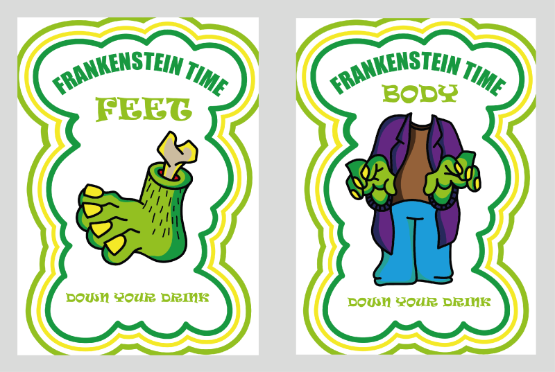

I had the idea to create a card game. Frankenstein was created with a range of body parts, awoken by a lightning bolt. Using this idea I was able to create a range of different cards. The aim of the game is to collect your body parts. Starting with the feet, the body, the head and finally the lightning bolt. Collecting them in this order would result in a forfeit. A drinking game, each card will present a task, every time someone collects an incorrect card, this will result in you or the whole group completing a task, with losers drinking and winners laughing.
‘Frankenstein time’ I felt as though these two words worked together well. The words represent an exciting game, that its suddenly time to play. I wanted to add a word to the end of Frankenstein to allow buyers to get a better understanding of what to expect when reading the title. Using a smaller word seemed appropriate to prevent such a large mouthful, the word is quick and straight to the point, which makes sense for a card game.
‘Feet’ I wanted to create and express ugly feet. Using the colours green and yellow, when feet and these specific colours come into the same category its instantly disturbing. Creating simplistic illustrations was something I would intend to achieve for the overall image of each card. When created, the cards will be a lot smaller, but it’s important the viewer can understand the concept correctly.
‘body’ I wanted the body to express a range of Halloween type colours to represent Frankenstein and his spooky image. It’s important each card is presented using the same colour, this was important to allow the overall theme to spread across the card game, to ensure the buyer can recall the card game visually from the colours alone.
‘head’ for head I wanted to express facial expressions that will relate towards the specific game. When holding the card, Frankenstein look shocked as to what he has seen, this helps relate towards the specific tasks the buyer will have to perform, the tasks are awkward and challenging and can result in each player becoming drunk.
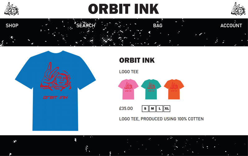
ORBIT INK
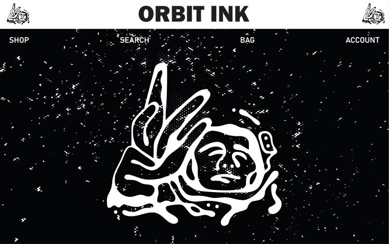
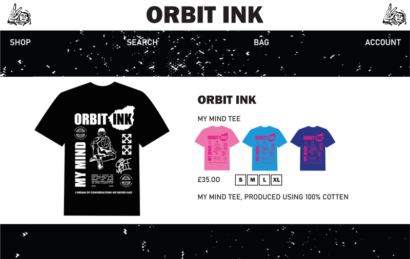
A streetwear clothing line. A brand that aims to bring something completely different to the streetwear world. The name ORBIT INK was chosen because we aim to Orbit worldwide, with webpages and Instagram accounts, ORBIT INK will promote and sell everything produced online. The Ink stylized designs and illustrations will also orbit across the clothing, from back too front, from sleeves too packaging. I want original graphic illustrations, to help represent the brand and what ORBIT INK is all about.
ORBIT INK logo. Creating a space man to represent the logo, the brand will orbit worldwide. The first thing that comes to mind when I imagine what orbits earth, would be a spaceman and for this reason this seemed appropriate. I’ve worked careful to create the best possible outcome, the logo will become the face of the brand, the most important aspect visually. When people think about ORBIT INK this has to be the first thing that pops to mind. The word orbit has also been used to represent the illustrations that will orbit the clothing. I want the brand to be known for its large range of illustrations, something that will bring originality to the overall identity of the clothing brand.
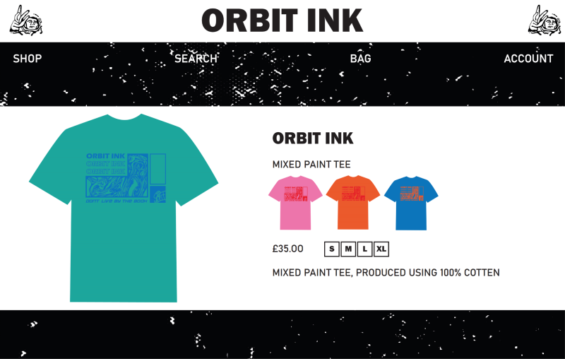
Paint swirl tee. I have mixed paint to create this natural swirl illustration. Using one colour to create this rectangular shape composition, 1 filled type and 2 outline type. I have attempted to ensure the placement and thickness of the composition spreads evenly throughout this design. Finished off with our signature placed on the bottom right.
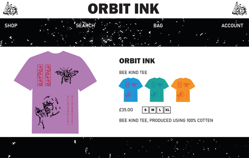
Bee kind tee. using the track pad on my laptop I’ve created these free flowing illustrations, something completely unique to my usual graphic style, experimenting with this style of drawing I was trying to produce something free within my illustrations. The illustrations are the woman from pulp fiction and a bee. The illustration on the left was created with paint splats. I believe the overall concept and composition is a success. I want to create more T-shirts using this design, to have this style to represent our identity as a free clothing brand doing things differently.
My mind tee. With a range of illustrations I have created this tee, experimenting with a range of colour, with illustrations covering the whole surface, the this tee really grips the orbit idea. The type has created a consciousness feel towards the concept, for this reason I’ve named the T-shirt ‘my mind’. The quote has been taken from frank oceans Siegfried song. The outline around the ‘INK’ has been created using a frozen strawberry shape, I feel as though this was more successful visually for this poster like design.
Worry A Little Less


Worry a little less is a children’s book aimed to help a little worry feel a little less daunting. The idea is to produce a range of worry books to help comfort children during worrying situations. The identity evolves around pure happiness. Through the bright cheerful colours, and humorous illustration. Helping children with a worry is something we aim to achieve, but believe with this book we can bring happiness and joy along the way. I wanted to create a range of characters, taking inspiration from the likes of Mario kart, we wanted the audience to create this attachment, a favourite character that may relate towards their specific worry. I began with a range of sketches, rather than taking inspiration from other artists, I wanted to create these unique shapes, trying to use my creativity to produce originality within each character. Then taking these sketches, and experimenting with colour, a more finalised graphic style for each character, I’ve really enjoyed the freedom producing these finalized characters, each with their own worry story.
Worry a little less about heights, albert the dragon will be the main character for this story. Being a dragon who’s afraid of heights the story will guide the viewer through each step albert takes to get over his dreaded fear.
Worry a little less about monsters. The character for this book will be called Jimmy Jr. Jimmy Jr will be a monster who is afraid of monsters. Jimmy Jr story may also express an important meaning, that you shouldn’t be afraid of who you are, and how people see you. His story will evolve around him trying to be scary, but scared of all the monsters around him.
Worry a little less about bullies. Princess swirl will be the man character for this story. Bullied for her amazing swirls, and looking slightly different to the other characters that will feature. Her story will help our audience express more confidence within themselves, helping them feel more secure with day to day life, and the people around us.
Worry a little less about the dark. Our character named Mea Mea will be the main character for this worry book. The character has a lantern and a paper bag upon his head to protect him from the dark and anything that lies within. He also has circular sensors that helps sense when something or someone is nearby.

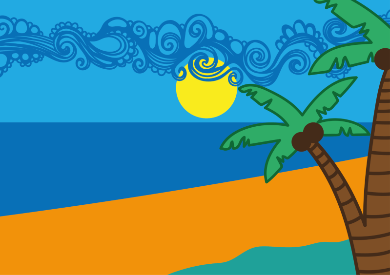
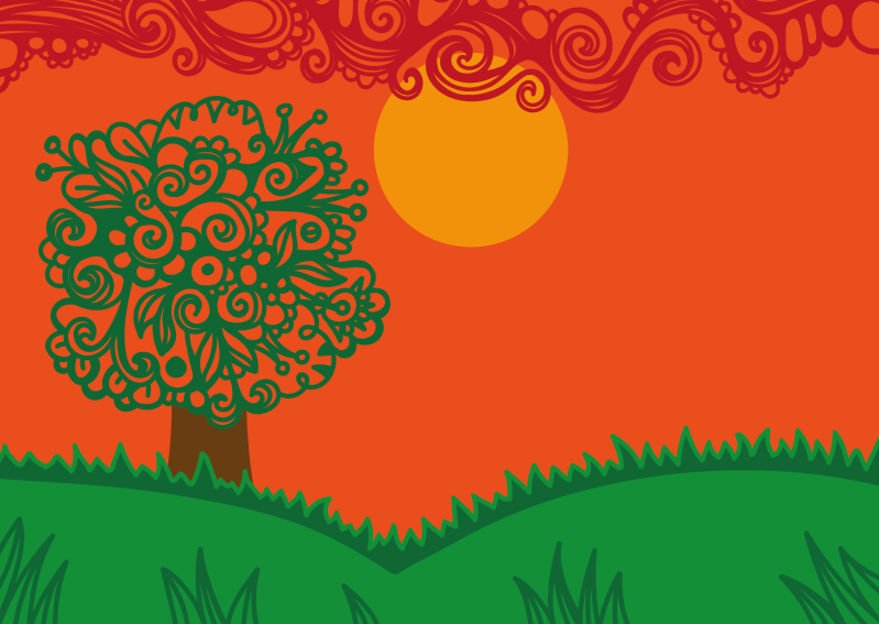
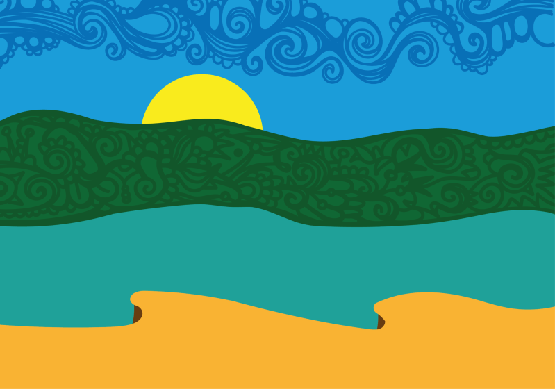
I have also worked on a range of backgrounds for the worry books, using bright vivid colour and swirl pattern, the backgrounds aim to represent happiness, something important visually for the audience. The backgrounds represent outdoors, fresher air has proven to relax people, heal depression, and help with anxiety, nature is an important aspect visually for the books, to encourage kids to go outside more often and enjoy the fresh air.
Overall the project has been very experimental and enjoyable, creating these visuals as a job role would be a personal dream, I live the freedom that comes with creating a children’s book.
Create Your Own Website With Webador